22 Sep
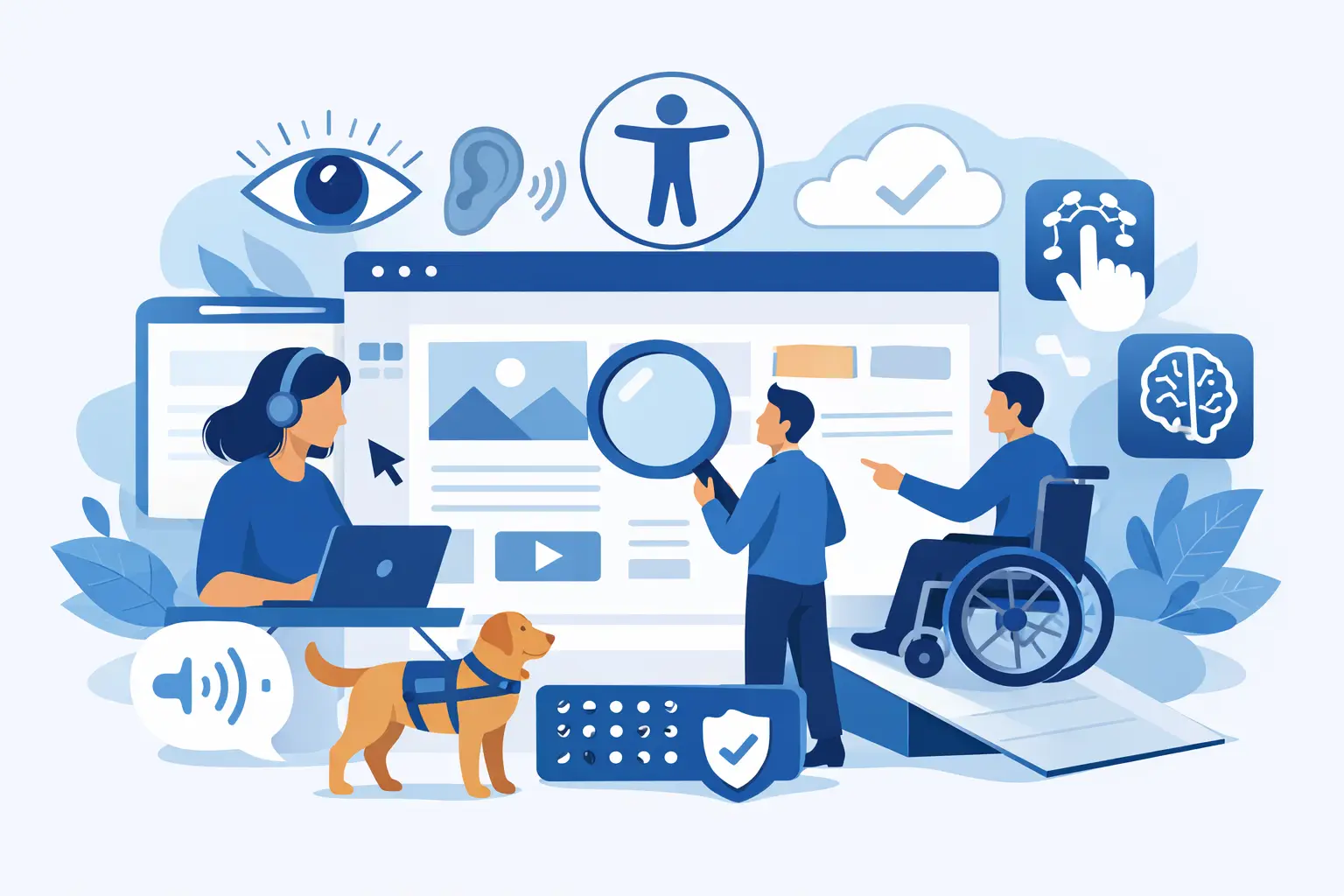
A customer should not have to fight your website to request a quote, book a service or complete a purchase. Yet small issues such as an unclear form label, a menu that cannot be used with a keyboard or poor colour contrast can stop people before they reach the part of your business that matters. Website accessibility features make those essential journeys workable for more people, while improving the clarity and quality of the experience for everyone.
For a business website, accessibility is not a cosmetic add-on to consider near launch. It is part of how the site performs as a customer-facing system. When it is planned properly, it supports conversion, customer service, search visibility and the long-term maintainability of your digital estate.
What website accessibility features should achieve
Accessibility means designing and building a website so that people with different access needs can perceive, understand, navigate and use it. This includes people who are blind or partially sighted, deaf or hard of hearing, have limited mobility, are neurodivergent, or have temporary impairments such as an injured hand or poor connectivity.
The practical question for a business is simple: can a customer complete the task they came to do, using the technology and settings that work for them? A site may look polished on a designer’s large screen but still fail this test if vital information is only conveyed by colour, a checkout times out without warning, or a screen reader cannot identify a button.
The Web Content Accessibility Guidelines, usually referred to as WCAG, provide a widely used framework. They organise accessibility around four principles: content must be perceivable, operable, understandable and robust enough to work with assistive technology. WCAG is a valuable benchmark, but compliance alone should not replace testing the real customer journeys that generate enquiries, sales and support requests.
The features that make the biggest commercial difference
Not every website requires the same solution. An eCommerce platform needs an accessible product search, basket and checkout. A professional services site may need straightforward contact forms, readable case studies and accessible document downloads. However, the following features form a sound baseline for most business websites.
Clear structure that works with assistive technology
A well-built page has one clear main heading, logical subheadings and content grouped in a meaningful order. This allows someone using a screen reader to scan the page and move directly to the section they need, rather than listen to every item in a long navigation menu.
Structure also benefits ordinary users. Clear headings make service pages easier to skim, help visitors compare options and give search engines better context about the page. The key is to use heading levels for content hierarchy, not simply to make text appear larger.
Keyboard-friendly navigation and controls
Many people navigate without a mouse, using a keyboard, switch device or speech control. Every interactive element – including menus, filters, accordions, pop-ups, forms and payment controls – should be reachable and usable by keyboard alone.
A visible focus indicator is essential. It shows where the user is currently positioned as they move through the page with the Tab key. Removing it for visual reasons creates a serious barrier: the site may technically accept keyboard input, but the user has no reliable way to know what will activate next.
Complex menus and modal windows require particular care. Focus should move into an opened dialogue, remain there while it is active, and return to the triggering control when closed. These details prevent users from becoming trapped or losing their place.
Readable text, sensible contrast and flexible display
Text needs sufficient contrast against its background, particularly for body copy, buttons and form messages. Pale grey text may suit a brand concept but can be difficult to read on a bright screen or for someone with low vision. Colour should never be the only way to communicate status. If a form field is invalid, explain the problem in text as well as using a red outline.
Users should also be able to enlarge text without losing content or functionality. Responsive layouts need to accommodate zoomed pages, narrow screens and different browser settings. Avoid fixed-height text boxes, horizontal scrolling for ordinary content and images containing essential words, as these all create unnecessary friction.
Typography is a business decision as much as a visual one. Appropriate line spacing, a legible font size and concise paragraphs make service information easier to absorb, especially where visitors are comparing suppliers or making a time-sensitive enquiry.
Meaningful images, media and documents
Images that communicate information need useful alternative text. The aim is not to describe every visual detail, but to provide the purpose of the image in context. A photograph used only as decoration may be ignored by assistive technology; an image showing a product fault or a chart supporting a decision needs an equivalent explanation.
Video should include accurate captions, while audio-only material needs a transcript. If a video demonstrates a process visually, consider whether an audio description or written steps are needed too. Autoplaying media is rarely helpful, particularly when it begins with sound or cannot be paused easily.
Downloaded PDFs, brochures and forms are often overlooked. If they are required to understand a service, make a booking or meet a contractual requirement, they must be accessible as well. In many cases, presenting key information as an HTML web page is easier to maintain and more accessible than relying on a document download.
Forms that explain themselves
Forms are often the point at which an interested visitor becomes a lead. Each field needs a persistent, visible label. Placeholder text is not a replacement because it can disappear once the person starts typing and may not be announced consistently by assistive tools.
Give clear guidance before a user submits the form, particularly where a format is required for a telephone number, reference code or date. When validation fails, identify the field, explain what is wrong and preserve the information already entered. A generic message saying “an error occurred” turns a simple enquiry into a support problem.
Ask only for the information your team genuinely needs. Shorter, well-designed forms are easier for all users and give your sales or operations team a cleaner starting point.
Accessibility must be built into the project, not bolted on
The most cost-effective time to address accessibility is while requirements, user journeys and page templates are being defined. Retrofitting a finished site can mean redesigning components, rebuilding navigation patterns and reworking third-party integrations that were never assessed properly.
A practical development process starts by identifying the tasks that matter to the business and its customers. For example, a visitor may need to find a local service, compare specifications, request a call back, create an account or pay an invoice. Each journey should be tested at key stages, not just reviewed as a collection of individual pages.
Designers can set accessible colour, type and component rules before visual concepts are approved. Developers can use semantic HTML, accessible names for controls and sound focus management from the outset. Content teams can then create headings, alternatives for images and plain-language instructions that work within the system.
Automated testing is useful for finding repeatable issues such as missing form labels, invalid markup and contrast failures. It cannot tell you whether a sentence makes sense, whether a menu is confusing or whether a screen reader user can complete a multi-step process. Manual checks and testing with people who use assistive technology provide the context automation cannot.
Where bespoke development adds value
Off-the-shelf themes and plug-ins can accelerate a simple site, but they can also introduce inaccessible components that are difficult to change. This is especially relevant where a website connects to booking tools, customer portals, stock systems, payment services or internal databases.
A bespoke approach allows accessibility requirements to be considered alongside the operational requirements. A customer portal, for instance, may need keyboard-accessible data tables, clear status updates, accessible document generation and secure authentication that does not depend solely on solving a visual challenge. The right answer depends on the audience, the service and the systems involved, not on a generic template.
At Compile, accessible design can be incorporated into a website or integrated software project from the early planning stage. This gives businesses a clearer route from customer requirement to tested, supportable functionality, rather than leaving accessibility as a late technical fix.
Treat accessibility as ongoing website care
A website changes after launch. New campaign pages, product ranges, staff updates, PDFs and integrations can introduce barriers even when the original build was carefully tested. Accessibility needs ownership in the same way as security, content quality and performance.
Set practical standards for anyone publishing content, including how to write headings, add image descriptions and create links that make sense out of context. Review priority journeys after significant changes, and schedule periodic accessibility checks as part of your maintenance plan. If customers report a problem, treat it as valuable operational feedback and resolve it promptly.
There is no single feature that makes a website accessible. The value comes from making hundreds of small decisions in a consistent way, then checking that real people can use the result. When your website removes obstacles instead of creating them, more customers can get on with choosing your business.
Related Post